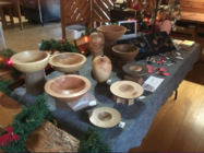
I'm getting ready to begin an annual show that runs 9 days. There are over 200 artists in this show and everyone's booth is judged and scored by 3 individuals for purposes of placement for the next years' show. So, a lot of time and effort is put into the displays, as much effort as is put into making the product.
There are 23 media categories represented in this show, and the one consistent theme in all is that the booth/display should showcase the work, not compete with it. If the first thing a potential buyer notices is how fabulous your display is, you've done something wrong. Solid colors without patterns are always a good choice. The display you create should be visible but then fall away into the background and let your work take center stage.
If you are using black or dark grays, you need to increase the amount of lighting because dark colors absorb the light. If your work is essentially all wood and wood tones, stay away from cold colors like blue shades. They give your woods a cold hue. Lighting for wood has always looked great under halogens, but those are also high energy and get hot. Newer LED's have different temperatures and going with 2500 to 3000k range will give you lower energy and heat, but a warmer 'tone' against your wood.
This is probably more information that you were looking for, but it may help others who are looking to up their game in selling their work.