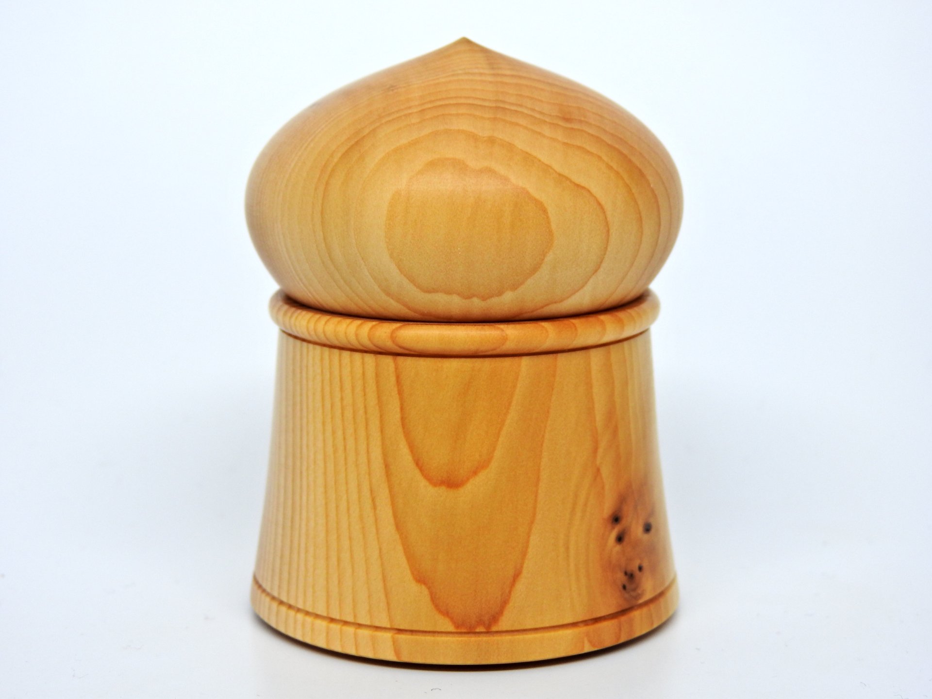
I hadnt even considered it really, though Ive been watching the thread, I find neither box appealing to me personally, as neither one looks to be "right" in proportions and I could not put my finger on it , but now that you mention the ratio, just my opinion but they don't exactly LOOK to be (Even though your separation line may be dead on) because of the visual "bulge" on the lids making the top seem larger than the bottom, and with no asymmetry to the rest of the box, nothing to really define where that other portion SHOULD be .... Then scolling back up the thread, the photo Gabriel Hoff posted caught my eye, and THAT, to me, looks to be in proper proportions and far more visually appealing... and comparing yours and his , I seem to feel that while his may have that bulging domed lid, the bottom of the box has that narrow waist just below line of separation and then the flare out to a wider bottom that visually it appears to be far less "top heavy" if you get my meaning? I think the golden ratio is far more than just a line of separation - it is more to do with where the eye is drawn to (Features such as beads, the narrower "waist" just below that flares out to the base, and stuff like that) - with your straight sides the only thing the eye is really drawn to is the very top and makes the whole appear to be "top heavy" like it would fall over if I so much as sneezed , while the box Gabriel posted looks like it would stand up to a hurricane, relatively speaking...