One of the things that is obviously important in showing your turnings in the best possible light (pun intended) is the technique used to photograph the turning. I am very interested in any suggestions on the best tools, equipment and techniques to use, as well as any suggestions of how-to instructional materials. I think I do some pretty nice turning but my photos never turn out very good. Any suggestions would be very much appreciated. Thanks, Ray

-
It's time to cast your vote in the April 2025 Turning Challenge. (click here for details) -
Congratulations to Steve Bonny for "A Book Holds What Time Lets Go" being selected as Turning of the Week for 28 April, 2025 (click here for details) -
Welcome new registering member. Your username must be your real First and Last name (for example: John Doe). "Screen names" and "handles" are not allowed and your registration will be deleted if you don't use your real name. Also, do not use all caps nor all lower case.
You are using an out of date browser. It may not display this or other websites correctly.
You should upgrade or use an alternative browser.
You should upgrade or use an alternative browser.
Photographing wood turnings
- Thread starter Ray Puffer
- Start date
- Joined
- Mar 25, 2008
- Messages
- 310
- Likes
- 288
- Location
- Suwanee, GA
- Website
- www.mikepeacewoodturning.com
I found that improving your turning photography is similar to improving turning. You need to practice and make note of what you need to change. You also need to read and re read the manual for your digital camera so you understand the impact of the custom lighting settings, use of self timer on a tripod, custom exposure settings and macro settings where appropriate. You also need to learn how to use a photo editing software package whether is one that came with your camera, freeware or something you bought. Getting feedback from someone that does good work is also helpful.
There are several excellent tutorials available on photographing turnings.
http://www.nealaddy.org/node/16 provides some great tips on using a free open source photo editing software called Gimp.
Another good one on setting up the equivalent of a do it yourself photo cube is http://www.jamiedonaldsonwoodturner.com/files/phrugal.pdf.
john lucas
AAW Forum Expert
Ray The most important thing is to understand that you do need to improve. From that realization you will put out the effort to do so and it's really not difficult with some exceptions. I shoot artwork of all flavors almost every day in my studio at Tennessee Tech University. I spent almost the whole day today shooting jewelry. I will be glad to help.
Ready through Neal Addy's site which is excellent. I have donated some article to that. Then when you try to shoot your work and have problems send me a photo showing the work and then a photo of your photo set up. I can usually point you in the right direction to solve your problem.
When I teach I use a translucent light booth because I feel it's more verstatile. My good friend Jamie teaches with an opaque light booth. Both work. I build my booth with PVC and a white translucent material like White nylon or cotton. the material is not critical, only it's ability to pass light.
A smooth clean background material, tripod and lights are all that are necessary. I prefer quartz halogen work lights of 300 watts or higher. The quartz lights are tungsten balanced and last a long time. You can often find them at the box stores with a light stand for very reasonable prices.
Thanks
John & Mike,
Thanks for your help. This will get me pointed in the right direction, I am sure. I'll try some things, then send as you suggest. Thanks, again. Ray
John & Mike,
Thanks for your help. This will get me pointed in the right direction, I am sure. I'll try some things, then send as you suggest. Thanks, again. Ray
Steve Worcester
Admin Emeritus
John is a bit too humble, but two of his articles on tis subject can be found here
http://www.turningwood.com/howtoo.htm
http://www.turningwood.com/howtoo.htm
photography
As we "speak" I am taking a 4 session photo course. First session last nite. With 20 in the class, I have the only point and shoot simple (olympus that is "waterproof") . A friend loaned me her camera last nite . Our homework was to read the manual, and look at the setting of our particular camera for shutter speed and aperture. I have it easy-nothing to look at. Looks like I'll have to bite the bullet and get a real camera. Next class sat at a nature center, I'd rather be turning, but....... Gretch
As we "speak" I am taking a 4 session photo course. First session last nite. With 20 in the class, I have the only point and shoot simple (olympus that is "waterproof") . A friend loaned me her camera last nite . Our homework was to read the manual, and look at the setting of our particular camera for shutter speed and aperture. I have it easy-nothing to look at. Looks like I'll have to bite the bullet and get a real camera. Next class sat at a nature center, I'd rather be turning, but....... Gretch
Steve Worcester
Admin Emeritus
Here's my photo setup with 5500k daylight spiral fluorescents in clamp lights, all from the hardware store. I built a little diffuser box out of visqueen and have it set up on my table saw. Where else would it be?
The fluorescents run cool so I can rest them right on top of the 6 mil poly. As you can see, the color is well balanced. The camera is just a Fujifilm pocket digital on a tripod. I used to work with professional photographers over in Hollywood shooting 4" x 5" format and picked up a few tricks about lighting which work for digital as well as film. Lighting is ninety percent of the shot.
A single bulb for each? Since I typically shot all the way stopped down (f 22 or more) and get a few seconds exposure time at about ISO 200, and thats with 350 watts per bulb (3 lights), I would think you get real long exposure times.
- Joined
- Jan 27, 2005
- Messages
- 13,098
- Likes
- 5,558
- Location
- Dalworthington Gardens, TX
- Website
- pbase.com
A single bulb for each? Since I typically shot all the way stopped down (f 22 or more) and get a few seconds exposure time at about ISO 200, and thats with 350 watts per bulb (3 lights), I would think you get real long exposure times.
Why f/22 unless you are shooting medium or large format? If using an SLR, images will start to get fuzzy beyond f/16 due to diffraction. If greater DOF is what you are looking for, the answer is to get further away from the subject. I do agree that a small aperture (not to be confused with f-stop number) is important. If using an SLR, I suggest using a medium telephoto and shooting from about 8 to 10 feet from the subject.
There is nothing wrong with making a longer exposure. Astrophotographers make exposures that are measured in hours. I am writing an article on this topic for our club's newsletter so I can post something when I get it finished.
I attended Jamie Donaldson's program on photography at SWAT and he had some very good information along with a different set up for a light box that I liked. It has the advantage of being very simple, portable, and cheap as opposed to all of the expensive and clunky equipment that I drag around. His set up can be see on his web site. His SWAT handout had a bit more detail, I believe. BTW, Jamie Donaldson's paying job was a professional photographer for forty something years and his clients were horses (rich horses). Makes good [horse] sense if you are in Kentucky.

Finally, there are at least a couple PDF articles on the AAW web site (that would be this site) although you would likely die of old age before finding them if trying to use the menus for a logical search. Since I knew of their secret hiding place, here are the links:
Article in AAW Journal by Bob Hawks
and,
More Tips by Bob Hawks on Photographing Turnings
Thanks, again
My thanks to everyone for your help on this. I now have some homework to do, then maybe I'll post some photos and ask for your feedback on them. Have a nice weekend, stay warm, and safe turning. Ray
My thanks to everyone for your help on this. I now have some homework to do, then maybe I'll post some photos and ask for your feedback on them. Have a nice weekend, stay warm, and safe turning. Ray
Russ Fairfield
RIP
John Jordan has an excellent atricle on photographing turned wood on his Website.
http://www.johnjordanwoodturning.com/John_Jordan_Woodturning/Photographing_Your_Work.html
http://www.johnjordanwoodturning.com/John_Jordan_Woodturning/Photographing_Your_Work.html
John Jordan
In Memorium
- Joined
- Jun 24, 2008
- Messages
- 506
- Likes
- 966
- Location
- Cane Ridge (Nashville), TN
- Website
- www.johnjordanwoodturning.com
John Jordan has an excellent atricle on photographing turned wood on his Website.
http://www.johnjordanwoodturning.com/John_Jordan_Woodturning/Photographing_Your_Work.html
Thank you, Russ. That article is dated, but the set-up is exactly the same. What has changed is at the time it was written, we were still using transparencies. I would shoot all the work with Fujichrome in my SLR, then put my little digital on the tripod and take digital snapshots-a whopping 60-80k file size, and no real way to adjust the white balance. Little did we know what was coming in a few years. I haven't shot a slide in years.
For what it's worth, I use a Maglite flashlite for the highlight on the back.
I took some shots recently to update it, but my workspace is so cluttered that I was embarrassed to use them.
")
John
Attachments
Steve Worcester
Admin Emeritus
Why f/22 unless you are shooting medium or large format? If using an SLR, images will start to get fuzzy beyond f/16 due to diffraction. If greater DOF is what you are looking for, the answer is to get further away from the subject. I do agree that a small aperture (not to be confused with f-stop number) is important. If using an SLR, I suggest using a medium telephoto and shooting from about 8 to 10 feet from the subject.
There is nothing wrong with making a longer exposure. Astrophotographers make exposures that are measured in hours. I am writing an article on this topic for our club's newsletter so I can post something when I get it finished.
If you go back too far, you use a longer lens and flatten out the image. The idea is to use a (35mm) focal length about 80-120 mm. Want as many pixels as possible and further back also opens up the tent to more stray light and reflection. Depth of Field is the ultimate goal, and eventually I will use Photoshop to combine the images. I do disagree with smaller F stops and diffraction. I was raised on the smaller F stop principles, but used more flash pops to give me light. In this case, I want to use constant lighting to view it (vs strobes).
The only issue with long exposure times are vibration (tripod and self timers that will expose after three seconds of shutter release) and reciprocity which really isn't a factor since I can take as many photos as I want and get the results instantly with no additional costs. I can always take more photos. Although with digital camera longer exposures tend to add more noise because the sensors heat up creating (purple) fringing and such.
(BTW, higher quality, multi-coated lenses have far less issues that they used to with defraction as well as movable/controllable light sources)
HI all,
I just read Neal Addys tutorial and he talks about lighting. He mentions using a compact fluorescent light of 5100K. I was at the hardware store and checked out the different CF's there were 6500K, 2700K and some with no number or K.
What does the "K" mean in these numbers ?
Thank you,
Jim
I just read Neal Addys tutorial and he talks about lighting. He mentions using a compact fluorescent light of 5100K. I was at the hardware store and checked out the different CF's there were 6500K, 2700K and some with no number or K.
What does the "K" mean in these numbers ?
Thank you,
Jim
Thank you Robert
- Joined
- Jan 27, 2005
- Messages
- 13,098
- Likes
- 5,558
- Location
- Dalworthington Gardens, TX
- Website
- pbase.com
A bit more about color temperature. The color composition of light has taken on quite a bit of prominence with the advent of digital photography, but it originated in the early part of the twentieth century when the International Commission on Illumination (or Commission internationale de l'Eclairage since the French always get to name things) and culminated in 1931 with the CIE XYZ Color Space, a mathematical model that made use of the Stefan-Boltzmann theoretical black body radiator that defines specific wavelengths of light in terms of Kelvin temperature. That color space is not something that we can easily wrap our brains around since it basically deals with mathematical abstractions, but it is the basis for other more practical color spaces (such as CIE Lab) commonly used today.
While daylight or artificial light consists of a broad spectrum of wavelengths rather than a single wavelength, color space models such as CIE Lab are based on the opponency model* of the way that our eyes/brain process color. This is what enables us to correlate the color of light with a specific Kelvin temperature. Daylight in the middle of a cloudless day nominally has a color temperature of 5250 to 5500 K depending on what definition you use. The typical incandescent bulb has a color temperature of about 2850 K. Fluorescent lights can be problematic because they can range from about 3000K to about 4500 K depending on type.
Sunlight provides the best lighting as far as exposing film or digital sensors is concerned because it produces a continuous broad spectrum of near-uniform lighting across the entire range of human vision (and well beyond). Incandescent lighting is mainly concentrated towards the red end of the spectrum. Gas discharge lighting such as fluorescent lights produce a non-uniform distribution of light with sharp peaks in intensity at various wavelengths. While the results look more-or-less the same to our eyes because our brains automatically adapt to different light sources, the same can't be said about film or digital sensors. That is why digital pictures will sometimes look blue or green or orange instead of what we expected to see.
So, what is all this color temperature stuff good for? Basically, it boils down to getting the colors "right". We don't want our bowl pictures to turn out blue (except for Steve who sprays his turnings with fourteen coats of auto paint ). We accomplish this by making sure that white is truly white (or actually, neutral is truly neutral). Many of the newer P&S (point and shoot) digital cameras allow you to create a custom white balance. You do this by taking a picture of an expensive white balance card or of a sheet of cheap copy machine paper -- they both are about equally effective (do not use the bright white ink jet printer paper because it has UV brighteners).
When photographing a turning, do not sit it on something distracting like a flowery tablecloth or chartreuse beach towel or cluttered table in your shop. Your background should be completely unobtrusive and disappear into the ... well, uh ... background. It should also be completely neutral -- no blue-gray or brown-gray -- just gray-gray. White is OK as long as it does not wash out the detail in the lower part of your turning. The camera should be slightly elevated above the turning so that the top (if it is a bowl) presents a narrows elliptical shape which, along with shadows, helps to give it three dimensional perspective. Be sure to keep the camera aimed level or else the image will have a type of perspective distortion known as keystoning. Keystoning is what happens when you point the camera skywards to take a picture of a tall building or when you point the camera downwards to take a picture of children.
Shadows are important because they help to give depth to your turning and show that it is actually sitting on something rather than floating in space. Also, shadows, should be very minimal. We do not want the shadow to be the main point of interest. Here is an example of one of my bowls that I think illustrates this: Small Cypress Bowl.
Depth-of-field is also very important. The entire turning needs to be in reasonably sharp focus. Point and shoot cameras and phone cameras do not usually have a problem in this regard because of the small lens to sensor distance. It is mainly an issue with SLR and larger format cameras. One solution (but not a good one) is to use a wide angle lens up close to the subject. The problem is that it causes the "fat nose" syndrome. A better solution is to use a longer lens (medium telephoto) and back off about 8 or 10 feet from the subject. The image in the above link was shot at a focal length of 135 mm and an aperture of f/13. The camera to subject distance was about nine feet. Even at an aperture of f/11 and slightly shorter focal length at the same shooting distance, the depth of field is good provided that you focus at the right point -- about midway between front and back. The mesquite bowl in the following link is ten inches in diameter and the lens focal length used was 105 mm: Mesquite Bowl.
Even at 200 mm focal length and about nine feet camera to subject distance, the concern about field flattening that Steve mentioned still seems acceptable to me, however, it may appear too flat to others. Here is an image of a small acorn shot at that focal length and distance and an aperture of f/13: Small Acorn.
My only other suggestion is to not use mixed types of lighting. Doing so will cause strange results that are basically unfixable in post processing. An example of this is mixing incandescent and fluorescent lights. You can adjust the white balance to compensate for either one, but not both at the same time because the lighting from both sources is not homogeneous. In some parts of the image the incandescent light will be dominant and in other areas, the fluorescent lighting will be dominant. You may wind up with orange or green shadows while the highlight areas look balanced.
------------------------------------------
* The opponency model describes the way that our brain processes colors that we see. The opponency in our vision consists of the difference between green and red and also the difference between blue and yellow. That is why you will never see a color that you would describe as greenish red or as yellowish blue. If either or both of these opponency components are missing in our vision, the result is color blindness. Besides total color blindness, some people have yellow-blue color blindness and others have red-green color blindness.
While daylight or artificial light consists of a broad spectrum of wavelengths rather than a single wavelength, color space models such as CIE Lab are based on the opponency model* of the way that our eyes/brain process color. This is what enables us to correlate the color of light with a specific Kelvin temperature. Daylight in the middle of a cloudless day nominally has a color temperature of 5250 to 5500 K depending on what definition you use. The typical incandescent bulb has a color temperature of about 2850 K. Fluorescent lights can be problematic because they can range from about 3000K to about 4500 K depending on type.
Sunlight provides the best lighting as far as exposing film or digital sensors is concerned because it produces a continuous broad spectrum of near-uniform lighting across the entire range of human vision (and well beyond). Incandescent lighting is mainly concentrated towards the red end of the spectrum. Gas discharge lighting such as fluorescent lights produce a non-uniform distribution of light with sharp peaks in intensity at various wavelengths. While the results look more-or-less the same to our eyes because our brains automatically adapt to different light sources, the same can't be said about film or digital sensors. That is why digital pictures will sometimes look blue or green or orange instead of what we expected to see.
So, what is all this color temperature stuff good for? Basically, it boils down to getting the colors "right". We don't want our bowl pictures to turn out blue (except for Steve who sprays his turnings with fourteen coats of auto paint
). We accomplish this by making sure that white is truly white (or actually, neutral is truly neutral). Many of the newer P&S (point and shoot) digital cameras allow you to create a custom white balance. You do this by taking a picture of an expensive white balance card or of a sheet of cheap copy machine paper -- they both are about equally effective (do not use the bright white ink jet printer paper because it has UV brighteners).When photographing a turning, do not sit it on something distracting like a flowery tablecloth or chartreuse beach towel or cluttered table in your shop. Your background should be completely unobtrusive and disappear into the ... well, uh ... background. It should also be completely neutral -- no blue-gray or brown-gray -- just gray-gray. White is OK as long as it does not wash out the detail in the lower part of your turning. The camera should be slightly elevated above the turning so that the top (if it is a bowl) presents a narrows elliptical shape which, along with shadows, helps to give it three dimensional perspective. Be sure to keep the camera aimed level or else the image will have a type of perspective distortion known as keystoning. Keystoning is what happens when you point the camera skywards to take a picture of a tall building or when you point the camera downwards to take a picture of children.
Shadows are important because they help to give depth to your turning and show that it is actually sitting on something rather than floating in space. Also, shadows, should be very minimal. We do not want the shadow to be the main point of interest. Here is an example of one of my bowls that I think illustrates this: Small Cypress Bowl.
Depth-of-field is also very important. The entire turning needs to be in reasonably sharp focus. Point and shoot cameras and phone cameras do not usually have a problem in this regard because of the small lens to sensor distance. It is mainly an issue with SLR and larger format cameras. One solution (but not a good one) is to use a wide angle lens up close to the subject. The problem is that it causes the "fat nose" syndrome. A better solution is to use a longer lens (medium telephoto) and back off about 8 or 10 feet from the subject. The image in the above link was shot at a focal length of 135 mm and an aperture of f/13. The camera to subject distance was about nine feet. Even at an aperture of f/11 and slightly shorter focal length at the same shooting distance, the depth of field is good provided that you focus at the right point -- about midway between front and back. The mesquite bowl in the following link is ten inches in diameter and the lens focal length used was 105 mm: Mesquite Bowl.
Even at 200 mm focal length and about nine feet camera to subject distance, the concern about field flattening that Steve mentioned still seems acceptable to me, however, it may appear too flat to others. Here is an image of a small acorn shot at that focal length and distance and an aperture of f/13: Small Acorn.
My only other suggestion is to not use mixed types of lighting. Doing so will cause strange results that are basically unfixable in post processing. An example of this is mixing incandescent and fluorescent lights. You can adjust the white balance to compensate for either one, but not both at the same time because the lighting from both sources is not homogeneous. In some parts of the image the incandescent light will be dominant and in other areas, the fluorescent lighting will be dominant. You may wind up with orange or green shadows while the highlight areas look balanced.
------------------------------------------
* The opponency model describes the way that our brain processes colors that we see. The opponency in our vision consists of the difference between green and red and also the difference between blue and yellow. That is why you will never see a color that you would describe as greenish red or as yellowish blue. If either or both of these opponency components are missing in our vision, the result is color blindness. Besides total color blindness, some people have yellow-blue color blindness and others have red-green color blindness.
Last edited:
- Joined
- Jan 27, 2005
- Messages
- 13,098
- Likes
- 5,558
- Location
- Dalworthington Gardens, TX
- Website
- pbase.com
If you go back too far, you use a longer lens and flatten out the image. The idea is to use a (35mm) focal length about 80-120 mm. Want as many pixels as possible and further back also opens up the tent to more stray light and reflection. Depth of Field is the ultimate goal, and eventually I will use Photoshop to combine the images. I do disagree with smaller F stops and diffraction. I was raised on the smaller F stop principles, but used more flash pops to give me light. In this case, I want to use constant lighting to view it (vs strobes).
The only issue with long exposure times are vibration (tripod and self timers that will expose after three seconds of shutter release) and reciprocity which really isn't a factor since I can take as many photos as I want and get the results instantly with no additional costs. I can always take more photos. Although with digital camera longer exposures tend to add more noise because the sensors heat up creating (purple) fringing and such.
(BTW, higher quality, multi-coated lenses have far less issues that they used to with defraction as well as movable/controllable light sources)
Steve, we are not talking about the same diffraction. It sounds like you are describing "flare" (internal scattering and reflections in a lens that lower image contrast and affect the modulation transfer function) while I was referring to the physics of light passing through the iris of a lens which results in a minimum diffraction disk size defined by Dawes limit. This physical characteristic determines the limit on image sharpness. There are some other factor that also must be considered. If using a lower resolution digital camera (something less than ten megapixels for an APS-C size sensor) can resulting in aliasing that effectively masks diffraction related loss of sharpness at f/22 at shooting distances of around ten feet. I can't get away with soft focus on my 18 megapixel camera. Final size of an image is also a factor to consider. Depth of field does not mean anything if the final physical size of the image is not known. In a thumbnail image everything looks sharp while a wall poster may not appear to have much depth of field if viewed close up.
However, as long as we are not talking about really close macro work and assuming a shooting distance of about eight feet or more, lens sharpness at f/22 will be less than it is at f/16 provided, of course, that the sensor has the resolution to see it and that it matters in the final image size.
Finally, CCD sensors may heat slightly, but it is not an issue with CMOS sensors. Basically, the heating in either is not the source of noise. If it were, video cameras would produce horribly noisy images. The long exposure noise comes from amplification of fixed pattern noise along with some other factors relating to amplification of the stored charge. The purple fringing has absolutely nothing to do with the sensor. Purple fringing can be seen in film camera images (if you can separate it from other noise) and in optical telescopes. It is easy to demonstrate to yourself if you happen to have a cheap quality lens and a top quality lens. Shoot an image under exactly the same conditions with both and examine the results. If it were the sensor you would expect to see the same purple fringing. Instead, it is easily seen that it is a lens characteristic related to flare. It does not always manifest itself as purple, but it is always seen on very high contrast edges which is probably why people assume that it is the sensor.
F-stop numbers: Note the division bar (/) in settings. The aperture is measured against the focal length of the lens. Big number = small aperture, small number = big aperture. Simple arithmetic.
Depth of focus: Also mathematics. Google ["circle of confusion"]; yes, that's what it's called. It relates to sensor resolution, and earlier related to grain size in the film. It doesn't refer to political discussions, although it could.
Color and brightness: My latest gallery picture is a really sorry example, but I like to photograph in daylight, on the shaded side of the building. That's why artists prefer northern light for studios for best lighting - southern light in southern hemisphere. Even daylight can vary in color temperature depending on time of day. Use custom white balance. Artificial light is more reliable, but even that can drift as bulbs age.
Mixed lighting: Well, it can be corrected a little, but it's like repairing a locomotive under way - technically interesting, but not much fun. Even worse with motion-picture film, because it needs a control strip for different shots. They call it "color timing."
Color perception: See the current (Feb. 2010) issue of Scientific American for recent investigations; title is "Seeing Forbidden Colors." Change your mind as needed. I think Bill already has.")
Depth of focus: Also mathematics. Google ["circle of confusion"]; yes, that's what it's called. It relates to sensor resolution, and earlier related to grain size in the film. It doesn't refer to political discussions, although it could.
Color and brightness: My latest gallery picture is a really sorry example, but I like to photograph in daylight, on the shaded side of the building. That's why artists prefer northern light for studios for best lighting - southern light in southern hemisphere. Even daylight can vary in color temperature depending on time of day. Use custom white balance. Artificial light is more reliable, but even that can drift as bulbs age.
Mixed lighting: Well, it can be corrected a little, but it's like repairing a locomotive under way - technically interesting, but not much fun. Even worse with motion-picture film, because it needs a control strip for different shots. They call it "color timing."
Color perception: See the current (Feb. 2010) issue of Scientific American for recent investigations; title is "Seeing Forbidden Colors." Change your mind as needed. I think Bill already has.
- Joined
- Jan 27, 2005
- Messages
- 13,098
- Likes
- 5,558
- Location
- Dalworthington Gardens, TX
- Website
- pbase.com
Joe, I have always loved the term "circles of confusion". It extends so far beyond the airy disks in optics.
Thanks for the teaser on the article in Scientific America -- I need to pick up a copy.
Thanks for the teaser on the article in Scientific America -- I need to pick up a copy.
Last edited:
john lucas
AAW Forum Expert
Sounds like some are confusing sharpness loss due to defraction with depth of field. F22 will usually not be as sharp as f 16 or even f 11 depending on what aperture is actually the sharpest on your lens.
this is different but related to areas that are in sharp focus due to depth of field or circle of confusion. It has been my experience that when you need maximum depth of field so a piece is in focus then defraction usually is not a problem. The overall image may not be as sharp in terms of resolution but the piece should still be in focus and the photo is perfectly useful. I frequently shoot jewelry at work using the smallest aperture on my lens. I know it's not as sharp but the difference is so subtle I don't have to worry about it.
As Bill said you should run a test to see because there are simply too many lenses and variables to say 100% for sure that you shouldn't use f22 or whatever your lenses smallest aperture is simply because it is less sharp than the sharpest aperture on your lens.
I constantly see misquotes about stepping back to improve depth of field. Depth of field will only be greater if the image size is smaller. If I shoot 2 images, one up close with a wide lens and one 10 feet away with a telephoto, they will both have exactly the same depth of field if the image(we'll say a bowl) fills the frame and is the same size in each photo.
If you back away and make the bowl smaller you will have more depth of field or more of the bowl in focus. Then you can enlarge it on the computer to get a usable size if you don't lose too much sharpness due to the cropping the photo ( and consequently the number of pixels used).
I too love the term circle of confusion. It's actually easy to understand. When you focus on a certain point the lens creates a circle, not a point. As you move away from that focus point the circles get larger, both in front of and behind that point. Somewhere in there the circles get large enough not to look like point so your eye thinks it's not as sharp. The area between the near point and the far point that is out of focus is called Depth of field. When you stop a lens down to a smaller aperture (f22 instead of f 4) the focus point is smaller. This means the you have to go further away from the focus point for the image circle to get large enough to appear out of focus. Consequently you have what appears to be more depth of field. Now if you enlarge the photo you enlarge the size of the focus dot so you affectively lose some depth to field.
Is that clear as mud. Hope so.
- Joined
- Jan 27, 2005
- Messages
- 13,098
- Likes
- 5,558
- Location
- Dalworthington Gardens, TX
- Website
- pbase.com
John, I am not really a big fan of the term "depth of field" except in just a very general sense. You can find various DOF calculators including the well known DOF Master online calculator and they all give DOF measurements down to tenths of an inch. Given that depth of field is really such a nebulous term, it is somewhat silly to try to state it in such extreme detail as if there were some sort of instantaneous jump from being in focus to out of focus. The definition that many calculators use is rather arbitrary and somewhat dated. The definition that I usually see is based on printing a full frame image on 8 X 10 paper. I think that nowadays not many people print uncropped images on 8 X 10 paper. More images are probably viewed electronically than printed and, for me, it is rare to not crop an image and then downsize the pixel count to make it viewable on a monitor without scrolling. Having 18 Megapixels to play with on my Canon 7D is really nice.
Another thing that muddies the depth of field idea is the disparity in pixel density between various cameras with sensors of the same physical size (such as APS-C sensors where pixel count ranges from about 6 MP to 18 MP). If we assign a certain ppi value for a printed image, the actual physical size can wind up being more closely associated with pixel density than to the actual sensor size. My criterion for shooting woodturnings is simple -- I look at the image at its final size whether printed or viewed on a monitor and decide if it is acceptably sharp. Based on that experience, I have settled on some favorite settings.
I like your statement that "Depth of field will only be greater if the image size is smaller". I first heard a variation of that from Jamie Donaldson at SWAT. He was comparing DOF between a wide angle lens and a telephoto lens and pointed out that objects appearing smaller seem to have greater DOF, but resizing objects to match in the two images will show that DOF is the same for a given aperture. After thinking about it for a bit, I concluded that it was intuitively obvious, but we have all been inundated with statements that contradict that -- with the misguided intent, I suppose of simplifying the matter.
Last edited:
john lucas
AAW Forum Expert
Bill Your statement, look at the image full size and decide if it's acceptable sharp is what it's all about. It the old days the DOF preview buttons darkened the screen. On a view camera when you stop down the image got so dark you couldn't really see the sharpness, you had to rely more on experience, understanding DOF, and the Scheimphlug rule for setting your swings and tilts, etc.
Now you just look at the image, enlarge it on your monitor and see if it's there. Simplifies it all and eliminates the dreaded circle of confusion.
Now you just look at the image, enlarge it on your monitor and see if it's there. Simplifies it all and eliminates the dreaded circle of confusion.
Steve Worcester
Admin Emeritus
Bill Your statement, look at the image full size and decide if it's acceptable sharp is what it's all about. It the old days the DOF preview buttons darkened the screen. On a view camera when you stop down the image got so dark you couldn't really see the sharpness, you had to rely more on experience, understanding DOF, and the Scheimphlug rule for setting your swings and tilts, etc.
Now you just look at the image, enlarge it on your monitor and see if it's there. Simplifies it all and eliminates the dreaded circle of confusion.
On the 4x5 you could put a loupe on the glass, I miss those days. I seem to remember there is still depth of view preview on the DSLRs too. Now you just shoot gobs of images and pick the best. No more waiting for the Kodachrome to come back and throw the batch on the light table. I shot Ectachrome too, but that was mostly sheet film.
John Jordan
In Memorium
- Joined
- Jun 24, 2008
- Messages
- 506
- Likes
- 966
- Location
- Cane Ridge (Nashville), TN
- Website
- www.johnjordanwoodturning.com
I feel like I've missed something here.
John
John
john lucas
AAW Forum Expert
Robert I'm sorry you were upset by Bill's post. I read it again and I simply don't understand why. I sure didn't read all of those things into it. I've read a lot of his posts on this and other sites and he never has been anything but helpful. Oh well, we'll go on to something else.
Robert,
I have to agree with John in that I re-read the entire thread and did not read into it those items that you mentioned. When you said 'don't quote me on this', I took that to mean you were being somewhat humorous in what you had to say. As a result, when you were quoted, it seemed entirely in keeping with the general direction of the thread.
It is true, however, that a thick skin is often required when participating in forums, and that is not limited to just ours. We all have to make an effort to re-read our posts to insure that we will not be taken the wrong way; as well as the same effort to re-read others' posts that we are not taking theirs' the wrong way.
I hope you will change your mind, and continue your helpful participation in this forum!
Steve Worcester
Admin Emeritus
I feel like I've missed something here.
John
Not really, move along, nothing to see here .....
Well I learned alot from this post. 


cc
cc
Steve Worcester
Admin Emeritus
Since I get to be the dad here, and I don't see anything wrong, please get back on topic.
john lucas
AAW Forum Expert
How to increase depth of field. There is a trick I use on occasion. It doesn't always work. Just raise the camera so the film (CCD) plane is closer to parallel to the lip of the bowl. To make this easy to understand. If you shoot straight down on top of the bowl it should be obvious that the rim would need a very shallow depth of field.
If you shoot a bowl from the side the depth of field needed is a great deal. Usually either the front lip or the back lip is in focus but not both. This is why you focus 1/3 of the way through the bowl to increase your chances of getting both rims in focus.
If you shoot the bowl from up higher you need less depth of field to get both front and back rim in focus. This is because the film plane is closer to the rim plane. There are trade offs of course. What if you have a really nice texture just below the rim. If you get too high you can't see the texture.
If in doubt about the proper focus point and depth of field look at the piece and decide what is the most important feature. Make sure that area is sharp.
- Joined
- Jan 27, 2005
- Messages
- 13,098
- Likes
- 5,558
- Location
- Dalworthington Gardens, TX
- Website
- pbase.com
Here is another "trick" to improve DOF, but it does require a bit of expertise in post processing images and it also makes it essential to shoot in RAW mode. Macro photographers (you know those guys who shoot bugs and other tiny things) must focus really close to the lens -- often just a couple inches away. At such a close focus distance, the depth of field is almost razor thin and even a tiny aperture like f/32 still won't have a very great DOF. The "trick" is sort of a variation on the "image stacking" done by astro photographers except that macro photographers do "focus stacking". This requires having a focusing rail which is sort of standard equipment with macro photographers since the normal focusing technique is by moving the camera rather than using the focusing ring on the lens which changes the magnification. Starting at one end of the subject, take an exposure, move the camera half the DOF, take another exposure, etc. Adapting this idea to shooting bowl images would be a bit more of a challenge since the focusing rail would need to be much longer than a macro focusing rail. It is also possible to do focus stacking by adjusting the focus ring incrementally, but that also changes the image magnification.
For fine-tuning the focus, especially in extreme close-ups, it's sometimes easiest to move the object within the field of view, with everything else stationary.
I can't remember the circumstances (probably the wrong optical setup), but sometimes the perfect object location is
inside the lens assembly.
I can't remember the circumstances (probably the wrong optical setup), but sometimes the perfect object location is
inside the lens assembly.
Steve Worcester
Admin Emeritus
I did some image stacking, in Photoshop. Shoot x amount of images, vary the focal point, open in bridge, grab images, move to Photoshop.
Granted, not inexpensive way to do it, but I would think this will be in Elements sooner or later, or available as a filter.
Granted, not inexpensive way to do it, but I would think this will be in Elements sooner or later, or available as a filter.
john lucas
AAW Forum Expert

- Joined
- Jan 27, 2005
- Messages
- 13,098
- Likes
- 5,558
- Location
- Dalworthington Gardens, TX
- Website
- pbase.com
I can't remember the circumstances (probably the wrong optical setup), but sometimes the perfect object location is inside the lens assembly.
That can occur when using extension tubes on a macro lens and the "in-focus' point is behind the objective. Not a very useful situation. Also, it is possible to design a lens with the second nodal point out in front of the objective lens. In this case, it is actually useful, because it allows long telephoto lenses to be made more compact.
I did some image stacking, in Photoshop. Shoot x amount of images, vary the focal point, open in bridge, grab images, move to Photoshop.
Granted, not inexpensive way to do it, but I would think this will be in Elements sooner or later, or available as a filter.
I have not tried any focus stacking myself, although Photoshop CS4 Extended has focus stacking built in so that it works similarly to some of the Photoshop plug-ins. I think that I will stick with CS3 for a while longer until I find a money tree.
The stacking that I have done is for astrophotography using Photoshop CS3 Extended which has statistical analysis tools for stacked images. Here is a link to a Lunar Image of the Apollo 15 landing site that I posted in an astro forum using these statistical analysis tools. My "telescope" was really just my camera with my 400 mm birding lens and two teleconverters stacked together to give me a total focal length of 1120 mm at f/16. The seeing was excellent that night with the moon near the zenith. I shot a lot of images and picked the best ones to stack. If you look hard enough, you might be able to see the base of the Lunar Lander.
The guys who do deep sky imaging will stack hundreds of images along with "darks" (dark frame images with no light to compensate for fixed pattern noise and other non-random noise sources) and "flats" (uniformly illuminated images that are used to compensate for optical imperfections) to obtain the most information possible.
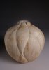
This was my first experiment with image stacking for DOF. This was 6 exposures. My DOF was only about 1/2" or a little more with the lens stopped down. I used photoshop 4 which makes it easy.
Very impressive, John. What is the surface that the knife is laying on? It is really interesting. The handle of the knife almost looks like it is transparent with the red light coming from inside of it.
Last edited:
john lucas
AAW Forum Expert
Bill The background was a piece of rubber matting we use in the darkroom. I put a red gel coming from the right to give some drama to the knife. There was a blue gel on the left to add a little color to the shadow areas. The low angle foreshortened the blade a lot so I would not normally shoot a knife this way. I just wanted to play with the DOF so I shot it really low to make it more difficult.
I often reverse a lens to get more magnification and to gain a little distance from the front (rear) element so you have room to get some light on the subject. I had to do this shooting bug larvea for our biology department.
I often reverse a lens to get more magnification and to gain a little distance from the front (rear) element so you have room to get some light on the subject. I had to do this shooting bug larvea for our biology department.
Thanks for identifying the rubber matting. It would have been so-o-o-o tedious to assemble a bunch of Lego blocks.
john lucas
AAW Forum Expert
Leggo's are evil. I've stepped on who knows how many barefooted going to the bathroom. Those square sharp edges hurt.
- Joined
- Jan 27, 2005
- Messages
- 13,098
- Likes
- 5,558
- Location
- Dalworthington Gardens, TX
- Website
- pbase.com
Leggo's are evil. I've stepped on who knows how many barefooted going to the bathroom. Those square sharp edges hurt.
That should teach you to pick them up after you finish playing with them.
Here is one more (expensive) way to increase the DOF without focus stacking or using a tiny aperture -- use a tilt-shift lens. They can be used to take care of both perspective distortion and DOF.
john lucas
AAW Forum Expert
Bill I've used tilt shift lens's and view camera's for years but you can get depth of field in 2 planes with stacking method. A good example was I had to shoot some wine glasses with cookies in the foreground and various plate settings. We showed them the narrow DOF shots that are popular now and they wanted everything sharp.
I tilted and shifted everything until I had the focus plane running roughly through the center of the stem so the DOF would then give me sharpness through the top of the goblets as well as the foot and still have the foreground and background in. I finally got it acceptably sharp but it was so picky. It would have been very easy with this stacking method.
The same is true when shooting rings. Usually I shoot them from above with the rings tilted. I have to swing and tilt the lens to get them in focus. You can't do both with a tilt shift lens. Since I can't use 4x5 on these anymore and my bellows only has swings I can only get one plane in focus. Even stopping down to f45 won't get the whole ring in because I'm shooting almost 1 to 1 magnification. The stacking method lets me do it quite easily although it does take time on the computer and my clients don't always want to pay for that. consequently I shoot it straight as best I can and they are happy.
john lucas
AAW Forum Expert
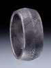
another way to get a fade background. This was shot on glass with a polarizer to eliminate the reflection. Then a fade background that my boss created in photoshop was printed on 11x14 paper. I place that about 2 feet behind the glass so I can light it separately and control how black it gets. The distance also throws any lines from the printer out of focus so you don't see those.
Since I shot this ring from a low angle I only needed the swings of the bellows to get enough DOF. Lighting Damascus can be trick especially with a glass surface to contend with. You can't put reflectors anywhere you need them because they will be reflected in the glass.
Since I shot this ring from a low angle I only needed the swings of the bellows to get enough DOF. Lighting Damascus can be trick especially with a glass surface to contend with. You can't put reflectors anywhere you need them because they will be reflected in the glass.