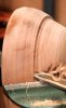
Here's the original photo, which was then Photoshopped into its stylized condition. We considered numerous variations and the author graciously took several new images for our use. I wanted an action shot to focus attention on the technical article on gouges. Our art director, Linnea, is very creative and has been doing an excellent job bringing variety and a lively look to the design and layout of the journal.
Thank you, Bill, for your constructive comments, much appreciated. Not sure if you noticed, but for the last two issues, we've had a new printer (although we failed to note that in the front matter of the August issue). I especially liked the quality of the color in the August issue, but am not so sure about this issue, at least the ones I have on hand. A few photos are "off."
P.S. I sent you a PM a few days ago via the Forum. Did you receive it?
Betty Scarpino, editor, AW