
Please look at the pictures I posted in the gallary
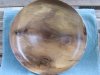
Image1
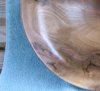
Image 2
I shaped the bowl so that it followed the shape of the original burl. It's 11.5 inches in diameter; sanded to 600 grit, applied 4 coats of deft lacquer then burnished the surface with some of the wood shavings from the turning.
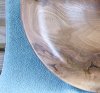
The bowl looks quit nice sitting on the kitchen table, but it really looks cruddy in the picture.
It was photographed with a Canon 4.0 mega pixel camera. The picture was taken outdoors, in moderate shade, no flash.
Image1
Image 2
I shaped the bowl so that it followed the shape of the original burl. It's 11.5 inches in diameter; sanded to 600 grit, applied 4 coats of deft lacquer then burnished the surface with some of the wood shavings from the turning.
The bowl looks quit nice sitting on the kitchen table, but it really looks cruddy in the picture.
It was photographed with a Canon 4.0 mega pixel camera. The picture was taken outdoors, in moderate shade, no flash.

")