• July 2025 Turning Challenge: Turn a Multi-axis Weed Pot! (click here for details)
  • Congratulations to Bobby McCarly for "Hemostatmorphodon" being selected as Turning of the Week for July 7, 2025 (click here for details)
  • Welcome new registering member. Your username must be your real First and Last name (for example: John Doe). "Screen names" and "handles" are not allowed and your registration will be deleted if you don't use your real name. Also, do not use all caps nor all lower case.

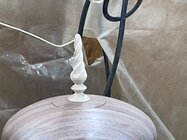
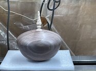
Need opinions on this box and finial

Joined
Nov 22, 2023
Messages
607
Likes
4,460
Location
Morganton, NC
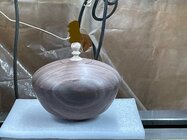
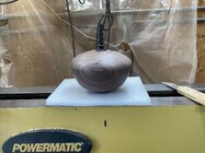
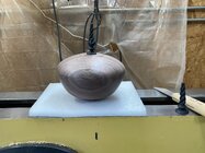
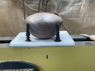
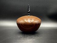
I was asked to make a lidded box and it’s not something I make often, actually been a couple years since I made one. I turned this one today and wanted to try a spiral carved finial for the lid, still need to sand it a little more. This is the first time I’ve ever tried a spiral finial and think it turned out okay for a first.

Question is, do you think it’s too big for this box? The box is 5” tall x 7-1/2” diameter, finial is 3-1/4” tall. It looks bigger in the photo than it do in person.
Box is black walnut, finial is maple. I’m considering using black India ink on the finial, what do you think???
1752446995785.jpeg

1752446954087.jpeg

1752446924321.jpeg
 
To me the finial looks a bit too fancy for the elegant shape of the rest of the piece and the color doesn't "feel" right. Black might be better - the white looks a little plasticy. Just my opinion. Worth what you paid for it. :)

Since it's a box, might consider something shorter and knobby.

JKJ
 
To me the finial looks a bit too fancy for the elegant shape of the rest of the piece and the color doesn't "feel" right. Black might be better - the white looks a little plasticy. Just my opinion. Worth what you paid for it. :)

Since it's a box, might consider something shorter and knobby.

JKJ
Thank John! Checks in the mail😁
I agree, black finial may look better.
 
Okay, if fluted is too fancy then go all in and paint it gold or silver. I suggest you put the finish on the bottom before making your final finial coloring decision. If you do consider painting the finial, some rough prototypes that you paint might inform your color decision.

The American Woodturner article A Closer Look at Ornament Finials by Janice Levi might be helpful.

Well done and good luck.
 
Last edited:
I think the best design of a finial involves decreasing diameters as you work from the base of the finial to the tip. The details I think look better if they include both convex and concave surfaces. The entire lid would look better if the convex / concave concept were applied, plus a little overhang may also help and the grain match doesn't add anything to the design.
 
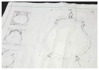
I forgot to mention what I almost always do when pondering design decisions: I make a sketch or sketches of ideas and options, dimensions, shapes. With design on paper I let my mind's eye vary the detail, color, and finish. This works better for me than turning and fitting. Some people are very good at designing the entire thing in the mind or while the wood is spinning but I'm unreliable at times, especially on pieces with multiple parts that fit together. I might draw a half-dozen options before I decide.

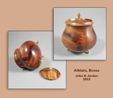
Here's one such sketch when designing a footed box with taper-fit lid, brass feet, and knob-finial. I did considerable thinking and erasing and redrawing, all before the blank was mounted in the chuck. No color decisions needed on this one once I decided on the materials.

1752461603816.png
box_albizia_brass_comp.jpg

I also sometimes make separate sketches of process steps so I don't forget and cut off a tenon or something needed later!

JKJ
 
David:
In my opinion, and that's worth exactly what you pay for it, the box is excellent. The shape, as someone else pointed out is very hollow form like and pleasing at least to my eye, the grain match is also excellent; if you didn't plan that you should buy a lottery ticket right away! The cherry on top though is the finial. I like the shape and the spiral flute very much and the contrasting colour of the maple goes well with the walnut. Who wrote the law about finials having to be black and extremely pointy anyway I think it was made to be broken! Well done; so well done in fact, I plan to blatantly copy this idea including the finial🤔🙄😁!

Cheers.

Barry W. Larson
Calgary, Alberta - currently in S. Ontario, Canada eh!
 
Fill in the blank...

Who wrote the law about finials having to be ... ____________

Over the years I've gotten grief from the self-appointed "Woodturning Police" elsewhere with comments like "That box lid doesn't have the right proportion" or "Your spindle is too thin" or "That finish is not glossy enough".

My answer to all of these is, quoting my brother-in-law: That's what YOU think.
Who appointed these police? Where did they get their narrow-minded license?

Opinions, especially when asked for, are entirely different. But if we all had to make things the same way life would be so boring. I'd quit all this and take up cactus farming.

JKJ
 
David, I like this piece, and I would agree with others that the black finial would work well. If I were to try to improve the finial, I might make it a bit thinner and lighter, and I would also make the transitions at the bottom of the finial in the form of gentle curves rather than sharp angles. I think this would match the flowing form of the box itself. Just my two cents.
 
Okay, I went out this morning and turned a thinner spiral finial, made just a little different. I like the black so just inked both of them.
I’m leaning toward the first one, even though it is a little bigger. But would really like to blame others if I chose the wrong one😁. “A” being the first picture and “B” being the second picture, I’m liking “B” better.

1752512706028.jpeg

1752512667912.jpeg
1752512628374.jpeg
 
It's a very nice piece. Wish I could turn those cork-screw finials like that. If I were to pick at one thing it would be the joint where the lid and body meet. Maybe you plan to refine this, but as it is, looks awkward to me. It accentuates the "corner", which I think is also too abrupt. It may move on you too, which would make it look even worse. I probably would have seamed it higher up and gave it some highlighting features.
 
It may move on you too, which would make it look even worse.

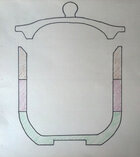
If it moves, and the box joint is tight, there may be more problems then how it looks - the lid might not fit. I've seen a lot of beads of courage boxes that had stuck lids. For that reason, I started making and teaching tapered lids for BOC boxes. Much easier for a kid with dexterity issues to open and close, and guaranteed not to stick.

Sometimes I do internal and sometimes external tapers.
The diagram shows an internal taper on the box. The visual aid shows an external taper on the box.
BOC_drawing_D.jpg BOC_P1090095.jpg

In fact, I started using tapered lids on other boxes too. Regardless of the "woodturners box vacuum pop fit" made to impress other woodturers with our skill, no user I know wants a box they have to pick up and hold with one hand while removing the lid with the other. A jewelry box on a dresser, for example, needs easy one-hand operation.

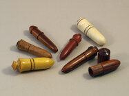
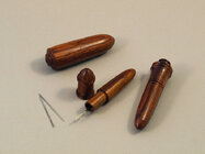
The only time I use a snug fit is for little pill boxes that can be carried in a pocket or in a sewing bag for needles.
Don't want them to open accidentally. But I make a long mortise/tenon - friction, no vacuum pop.
needle_casesA.jpg needle_casesB.jpg

JKJ
 
Having read all that came before, I'll say that the finials are fine as they are. However, like John, I think I would consider a smaller, bulb-type finial. You will achieve a great result no matter how you do it.
 
Beautiful work as usual David. Really admire all of your work you've made. Seem to have the same taste or design sense as your work even though I am not there yet. I personally would go with some kind of shape the same as the lidded box or some variation of a knob with some sort of texture possibly. As for finials not a huge fan, that's just me, B would be my choice. Again awesome vessel design.
 
Last edited:
My two cent vote goes for the one that sits down more (right on the pic of both, I think that's B?). While I'm offering a solicited opinion I'd also make it shorter, about half the current height.

Everyone has an opinion, only your's counts...
 
Last edited:
Back
Top