• Beware of Counterfeit Woodturning Tools (click here for details)
  • Johnathan Silwones is starting a new AAW chapter, Southern Alleghenies Woodturners, in Johnstown, PA. (click here for details)
  • Congratulations to John Shannon for "Walnut Bowl" being selected as Turning of the Week for May 27, 2024 (click here for details)
  • Welcome new registering member. Your username must be your real First and Last name (for example: John Doe). "Screen names" and "handles" are not allowed and your registration will be deleted if you don't use your real name. Also, do not use all caps nor all lower case.

Please critique my photography.

Joined
Jul 18, 2006
Messages
643
Likes
2
Location
Central Florida
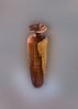
I'm really beginning to appreciate how important photography is when you are tryiing to present your work on the web. I could sure use some help with this photo. It's 16" tall and 5" max width.

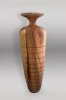
If I shoot it straight on I think the photo starts to look too flat. If I shoot from above I start to get perspective issues that make the piece look shorter than it is. Depth of field also starts to be more of an issue.

This picture was shot with a DSLR on a tripod, f8, 1 second, about 35mm (a 10-22 zoom with a 1.6 crop factor due to sensor size). The background was removed, replaced with a digital gradient and a shadow added.

All comments, critiques and suggestions welcome. If you care to offer your thoughts on the turning as well, they would also be welcome (good or bad).

Ed
 

Attachments

  • AAW_elm_urn.jpg
    AAW_elm_urn.jpg
    29.7 KB · Views: 287
Joined
Jul 18, 2006
Messages
643
Likes
2
Location
Central Florida
Just wondering why you added the shadow?

I think the angle of the photo plus the background replacement makes it looks very two dimensional. It doesn't seem to have any depth. I added the shadow in an attempt to give some depth to the image.

What do you think? Does it help or not?


Ed
 
Joined
Dec 10, 2006
Messages
578
Likes
7
Location
Mesa, Arizona
Ed,

It's hard to say whether you improved the presentation with your digital wizardry or whether things would look better without the digitally altered background. I think the shadow and digital gradient aren't helping. It's hard to tell, but the lighting of your piece seems to be coming from the upper front right with some fill lighting from the left. If so, the background (darker at the top than at the bottom) and the shadow (one coming from the right and nothing coming from the left) don't match the lighting of the piece. It gives a kinda-nice-yet-jarring surrealistic quality to the picture.

Here are my suggestions: Re-shoot with a slightly longer lens (about 45mm, rather than the 35mm you used) and a slower f-stop in front of a neutral background. I'd try to light it about like you did -- so that shadows are not eliminated, just subdued. The longer lens and the slower f-stop should improve your depth of field. Then, I'd move the camera angle a little higher so you can barely see both the front and the back of the rim in the picture. I think that angle is both more "natural" to the eye (we tend to look down, if only slightly, on vases) and would tend to emphasize the length of the piece. Again, this may end up giving you a far worse result than your current picture, but that's what I'd try next.

Hope this helps. Love the vase, by the way.
 

john lucas

AAW Forum Expert
Joined
Apr 26, 2004
Messages
8,369
Likes
3,628
Location
Cookeville, TN
I agree with David, a slightly higher angle so you see the depth of the lid, more depth of field if necessary and a little more contrast. The image looks flat because there is very little contrast between the left and right side.
You can sometimes make one side a little darker by putting a black card just outside the frame so it shades the left side. You could move the right side light a little further forward so you don't loose detail in the front of the piece. With the right side being fairly bright and the left side being more in the shadow you will create a little more shape to the piece.
Adding a shadow the way you did only gives the piece a base. It would appear as though it was floating if you didn't have a shadow but it really doesn't add any depth to the piece itself.
If your that good on photoshop try burning in the left side and possible dodging the right side. That might help, or you could just raise the contast a little.
 
Joined
Jul 18, 2006
Messages
643
Likes
2
Location
Central Florida
David - Thanks for the thoughtful reply. I'll take another shot with your suggestions. You can see what the original looks like below (acutally this one has the vase slighly rotated, but it was taken at the same time with the same setup). You can see why I deleted the background. I should really invest in a good gradient background. It would be a lot easier to get the shot right to begin with than try and fix it in photoshop later. Although I do enjoy playing with photoshop.

The only source of lighting is a window that can bee seen on the right behind the "tent". It's at about 45 degrees and above. The window faces Northwest and the picture was taken around noon so it's indirect daylight from that one source for the illumination.

Ed
 

Attachments

  • AAW_elm_notouch.jpg
    AAW_elm_notouch.jpg
    51.6 KB · Views: 258
Joined
Jul 18, 2006
Messages
643
Likes
2
Location
Central Florida
John - Thanks for the tips. I think I understand what you are saying and why that would make the picture look flat. I'll see what I can do to add some contrast in photoshop tonight.

As you can see in the picture that I posted in my reply to David, my lighting is pretty lame. I'll have to break out some lamps and take some shots with different lighting tonight.

I guess good lighting on a good background would make the whole process easier. But buying photo stuff would mean less money available in the turning budget. Tough choices.

Ed
 

Bill Boehme

Administrator
Staff member
Beta Tester
TOTW Team
Joined
Jan 27, 2005
Messages
12,907
Likes
5,204
Location
Dalworthington Gardens, TX
Website
pbase.com
I hate to be the bearer of bad news, but your Photoshopped background sticks out like a sore thumb. The quantizing effect of 8-bit color depth for a monochrome color (especially with jpg images) just does not work. It is missing several vital key elements. First of all, the background will normally be mounted on a sweep so the linear gradient doesn't work there -- same applies to the shadow, not to mention that it is too uniform and shouldn't have sharp edges unless you have a point source light. The background will always pick up color from the turning, especially at the base of the turning where the proximity is very close. Ideally the lighting needs to be arranged to show the curvature of the sides which means that you do not want to illuminate the sides too much. I would also avoid directly illuminating the background (when you use a real background) as much as possible except for a high key type of shot.

The angle of the photograph is wrong, in my estimation -- you should have the camera mounted level or slightly down and slightly above the base of the vessel so that you can see an oval opening at the top -- otherwise, it may as well be a solid object like rolling pin or baseball bat rather than a vase (if I can't stick my finger in it, I would at least like to peek at the opening). I am not sure about the lens since the EXIF data is missing, but I would use something in the range of 70 - 100 mm FL to keep from getting the bulging effect that comes from using a wide angle lens too close to the subject.

Bill
 

Bill Boehme

Administrator
Staff member
Beta Tester
TOTW Team
Joined
Jan 27, 2005
Messages
12,907
Likes
5,204
Location
Dalworthington Gardens, TX
Website
pbase.com
I see that you added a picture of your set up. I personally don't think that the light box is a good way to photograph woodturnings -- it works better for high key product photography. I would suggest something like Varitone background paper (light gray to dark gray or medium gray to black) or just a medium gray on a long sweep. You can use some strategically placed black panels to block light from the upper part of the background in addition to the use that John Lucas mentioned of partially shading one side of the object.

Bill
 

john lucas

AAW Forum Expert
Joined
Apr 26, 2004
Messages
8,369
Likes
3,628
Location
Cookeville, TN
Ed you can do two things really easy to improve the look of the photo. First is simply move the piece closer to the right side. This will increase the light on that side and reduce it on the other. Then put a piece of black paper on the left side to increase the contrast further.
You can bounce light back into the front of the piece with a white card if necessary. You can try simply placing the card inside the box so it picksup light from the right hand wall or you can try picking up the light from the widow and bouncing it back in.
To get a faded background simply try to get the background further away and then shade it if possible.
I like light boxes for beginners. There are a ton of options for controlling the light and usually the pieces look OK straight from the box. Your first shot isn't bad and lets us talk about the piece. All the details are there except for seeing the top which would tell us if it's hollow or not. What we are mostly talking about here is improving the 3 dimensional quality of the photo.
 
Joined
Apr 26, 2004
Messages
349
Likes
0
Location
Rural La Farge, Wisconsin
Website
www.token.crwoodturner.com
Ed, if you will be doing more turnings on this scale, take a look at your local home do-it-yourself center for a 4 x 8 sheet of flexible vinyl wall covering, around $20 last I checked. I think it's 2? 3? millimeters thick, and comes in white--textured on one side but plain, smooth white on the back. Roll it up and stick in a closet when not using,

White is the most versatile as you can get any shade of gray with strategic placement of lights, although getting a nice even gradiant like your digital work is tricky. The bigger the area behind the subject, the easier it is to go from white in the foreground to black in the distance.

Another thing: perspective distortion is caused by tilting of the camera's focal plane in relation to the subject. So, assuming your vase is sitting vertically plumb, do the same with your camera. If you need a higher viewpoint to show the vase's opening, you will just have a larger area of unwanted image to crop out above the subject. The opposite holds true for shooting buildings. Pros like John Lucas use a camera with vertical adjustments on the lens, as well as tilt, to avoid convergence of vertical lines and be able to use the full image area without cropping. To simplify: keep your camera parallel with the subject, even if you need to do some drastic cropping. Easily done with a good quality camera like yours.
 
Joined
Jul 18, 2006
Messages
643
Likes
2
Location
Central Florida
Thanks for all the great advice guys. You all have given me a lot to think about. I'm working on some stuff for the club newsletter so I don't think I'll have time to attempt another photo.

I have looked at professional backgrounds at places like B&H Photo, but I just can't bring myself to drop $50 - $100 for one. I did run out to Home Depot after dinner to look for the viny sheet that Ken mentioned. $20 I could live with. Unfortunately vinyl wall covering must not be in demand in South Florida because they didn't have any for sale. They did have bunches of it that they had used for signs and backers for some shelving, but nothing for sale.

Once again, thanks to all for the great comments and advice.

Ed
 
Joined
Apr 26, 2004
Messages
349
Likes
0
Location
Rural La Farge, Wisconsin
Website
www.token.crwoodturner.com
Another material to look for is vinyl banner stock, or poster stock. Much thinner than that wall covering, but very durable and washable. I salvaged a 36" x 48" poster of the stuff and use the back side. Most of my gallery photos for the last 1 1/2 years use it, and it's still as white as the day I acquired it. Look up a printing company, maybe they have misprints or may have a 6-8 ft long piece to sell new.
 

john lucas

AAW Forum Expert
Joined
Apr 26, 2004
Messages
8,369
Likes
3,628
Location
Cookeville, TN
Check out www.porters.com They have a lot of backgrounds. I use the Thunder gray seamless paper backgrounds the most. They come 4 feet wide but you can cut them with a handsaw to the width that works for you. They are 12 yards long so they last a long time. The Thunder gray photographs somewhat light below the piece but is easier to make the top go dark by shading.
Jamie Donaldson teaches everyone to use vinyl window shades. They do work sometimes. I had trouble with them showing wrinkles but I probably used a cheap shade. Buy a good quality one and see if it will work for you. For smaller pieces I use poster board. You can get it in pretty good size pieces.
 

Bill Boehme

Administrator
Staff member
Beta Tester
TOTW Team
Joined
Jan 27, 2005
Messages
12,907
Likes
5,204
Location
Dalworthington Gardens, TX
Website
pbase.com
Thanks for all the great advice guys. You all have given me a lot to think about. I'm working on some stuff for the club newsletter so I don't think I'll have time to attempt another photo.

I have looked at professional backgrounds at places like B&H Photo, but I just can't bring myself to drop $50 - $100 for one. I did run out to Home Depot after dinner to look for the viny sheet that Ken mentioned. $20 I could live with. Unfortunately vinyl wall covering must not be in demand in South Florida because they didn't have any for sale. They did have bunches of it that they had used for signs and backers for some shelving, but nothing for sale.

Once again, thanks to all for the great comments and advice.

Ed

You can get the Varitone graduated background paper (which is actually washable vinyl) at a cost of about $10 for the small size (22" X 15"), $30 for the medium size(31" X 43"), or $60 for the large size (which is far bigger than what you would need at 42" X 62"). The small size works for most small things like bowls under about 10", pens, bottle stoppers, boxes, etc. I doubt that you would ever need anything larger than the medium size. The small size Varitone paper is used in landscape orientation while the other two are used in portrait orientation. B&H has a similar product, but I believe that it is paper and I think that the price is higher.
 

Steve Worcester

Admin Emeritus
Joined
Apr 9, 2004
Messages
2,694
Likes
97
Location
Plano, Texas
Website
www.turningwood.com
I have a varitone myself, works well.
That aside, don't put a prominent element, like the sapwood, directly in front. take out the background and look at just the two photos you posted. The one that has the sapwood to the side,leads your eye into the photo then out, the one with the sapwood in the middle, leaves your eye there with no proverbial exit. We read things from left to right and like it or not, want to pan somewhat smoothly even in a photo.

Try it with the sapwood on the left or the right, photoshop flip it, no matter, gives you the same visual effect.

As far as perspective, with a vessel that tall, anything below a 50mm equivelant will be an issue, and above, say to a 135mm would work better, but require more space behind you. The only way to square it up is with a view camera. (Come on by and I can put you in behind mine!).
I don't have too much problem with the perspective, but this image is small and makes it hard to tell. Almost cheaper to send it to someone and have them photograph it for you if it matters that much. But the Photoshop background looks fake. I want real shadows and gradiant backgrounds.
 
Joined
Jul 18, 2006
Messages
643
Likes
2
Location
Central Florida
Here's my latest attempt, using the great advice you guys are giving me. I think it's an improvement, but I've encountered a whole new set of challenges and I still have a long way to go to (hopefully) get a great picture.

It's a tall piece (16") and the opening in the top is aroung 1/2" (it's hollow, but I didn't hollow from the top). I had to move the camera really high and way far away to keep the senor in plane with the turning and still be able to show the inside of the rim. As several of you suspected, this led to really drastic cropping. The camera is 6mp and after cropping I was around 300 x 400 pixels. Not much to work with there.

I never really understood why anyone would need a tilt and shift lens. All I can say now is "ah ha!!". $1,000+ for a canon tilt and shift. That ain't gonna happen. Paying a pro to do it doesn't make much sense for me either. I'm not a pro and I don't sell my work. It's just a hobby.

There is a small chance that I may be able to simulate tilt / shift in photoshop. It may not be the perfect solution, but the price is right. I've decided to bite the bullet and get a good background. I'll investigate the sources you mentioned.

Anyway, here's where I'm at now. Clearly not perfect, but do you think I'm heading in the right direction or not?

Ed
 

Attachments

  • CRX_0484.jpg
    CRX_0484.jpg
    28.6 KB · Views: 73
Joined
Mar 13, 2005
Messages
231
Likes
1
Location
Newville, PA (south of Harrisburg)
Website
www.torne-lignum.com
Ed, this is the opinion of an observer rather than from the technical photographer's point of view.

The first photo has a mystical (or surreal as mentioned) air, I like it for that but it doesn't portray your turning to it's best, which is what you're after, right.

The positioning of your turning in the one of your photo booth is my favorite. I can see the shape and proportion, imagining the size. The sapwood on the left is more appealing to my eye.

The last picture just doesn't do anything for me, the light at the bottom doesn't compute to my eye, the proportions of the form are vague. It might be too high an angle, not sure.

Not knowing much about the workings of photography, just trying to tell you what I see as a mere viewer.

Ruth
 
Joined
Jul 18, 2006
Messages
643
Likes
2
Location
Central Florida
Thanks Ruth - As I look at the two pictures side by side, I have to agree that I've lost something in my latest attempt. Trying to show the inside of the top has caused me to lose any view of the exterior profile of the neck and rim. In retrospect, that wasn't a good trade-off for a view of the interior of the rim and the vessel opening.

This is tough stuff. That's one advantage of digital. Once you have the equipment, the pictures are free. Time to try again.

Ed
 
Joined
Jun 27, 2005
Messages
173
Likes
0
Location
CarmelHighlands, California
Cameras are recording devices. They produce images that are evidential in character. It's an old principle in photography that if you are going to do things to the photograph that give up the evidential character of the photograph, producing a derivation, you need to have a very good reason for doing so as you are giving up most of what photography has going for it. The background especially violates this principle. The photograph looks Photoshoped and isn't believable.

As for the lighting and the box, a common device for product photography, while convenient, it greatly limits what you can do. The turning deserves better.

When looking at a photograph of a turning, one should be responding to the turning, not the photography.

I hope this is helpful. For many years I was a commercial photographer in New York. It's a principal we were all very aware of. I think Photoshop is a wonderful program but the fact that it will do something doesn't mean that doing it is appropriate.

Malcolm Smith
 

john lucas

AAW Forum Expert
Joined
Apr 26, 2004
Messages
8,369
Likes
3,628
Location
Cookeville, TN
Ed I think you missunderstood us. We did say get higher but really only meant a few degrees. Just enough that you can see that there is depth to the top. What I do in the studio is to raise the camera until I can see the back rim and then a tiny bit more. This gives the illusion of depth and a hint that the piece might be hollow but you haven't gone high enough to distort the shape.
When you get really high like you are in the second photo you could feasibly change the shape using a tilt shift lens but then the piece would be close to the proper shape but the lip would look funny.
For craft work I prefer to use a lens in the 135 to 200 focal length. It doesn't distort the image and shows less background behind the piece so your background can be smaller. It also gives you more area to work in between the camera and the lens.
I do agree that a photo booth limits you somewhat on the kind of photography that you can do but it solves so many other problems for newbie's that it's worth trying. You can build them so cheaply with PVC and white material. I like to make free standing panels so I can take one out if necessary or even just use on panel. On really glossy subjects panels are not the way to go. I have a handout on shooting really glossy subjects that i can e-mail. It's not for the faint of heart but if your pieces are dark wood with a glass like finish you will find it useful.
 

Bill Boehme

Administrator
Staff member
Beta Tester
TOTW Team
Joined
Jan 27, 2005
Messages
12,907
Likes
5,204
Location
Dalworthington Gardens, TX
Website
pbase.com
The angle and height of lens on the last shot is far too high and way too much tilt down. I can see why you had a problem with the cropped image size. Try getting high enough so that the oval that you see at the top has about a quarter the height of what you have in that last shot. Also, don't try to Photoshop a background ... it will never work.

...................................

Steve,
I am envious of your view camera. I'll bet that you also drive a Woody with a platform on top.

...................................

WRT spending $1000 for a T+S lens: If you are into photography, you eventually get numb to the cost of equipment (as in most hobbies). The camera is the least expensive thing in my camera bag.

Bill
 
Joined
Jul 18, 2006
Messages
643
Likes
2
Location
Central Florida
Malcom - I'm certainly struggling with my attempt to somehow communicate as much as possible of the experience of being able to handle and examine my turning in a signle image for those who can't lay hands on it.
I can appreciate how a professional photographer would feel about excessive use of photoshop, but since I'm lacking the appropriate tools and skills I am going to have to make do with what I've got.

John - I would love to receive your handout. I think I understand a little better now, but it's going to take a lot of practice and work with the camera before I can hope to start producing something reasonable. In the last 24 hours, I certainly have gained an even greater respect for professionals who do this for a living.

All - Once again thanks for the comments and advice. I think I've gone as far as I can with this piece. Time to head out to the shop to make something new.

Here's my final attempt that I'm going to post in the gallery. Not perfect, but as good as I'm going to get right now.

Ed
 

Attachments

  • CRX_0489a.jpg
    CRX_0489a.jpg
    58.5 KB · Views: 79

Bill Boehme

Administrator
Staff member
Beta Tester
TOTW Team
Joined
Jan 27, 2005
Messages
12,907
Likes
5,204
Location
Dalworthington Gardens, TX
Website
pbase.com
Ed, see my reply in red inside of your quote.

.......I can appreciate how a professional photographer would feel about excessive use of photoshop, but since I'm lacking the appropriate tools and skills I am going to have to make do with what I've got.
Professional photographer? Actually, I don't DO anything. In a former incarnation (before retirement), I was a rocket scientist. In other words, I am a bum and on my way to becoming a artist. :p

John - I would love to receive your handout.
I would love a handout from John, too! ;) Even if it is a paper on photography.

Here's my final attempt that I'm going to post in the gallery. Not perfect, but as good as I'm going to get right now.
For us measurebators, at least straighten it up so that it doesn't look like it is falling. :D Also, you can go to Hobby Lobby or Wal-Mart and get some poster paper for a buck or so. Go for white or light gray -- it really works quite well. If you have some automotive light gray primer spray paint, you can paint the poster board and make it more or less non-reflective so that it won't glare back at you as much. Take it from a retired bum (on my way to becoming a philosopher), the quality of a picture is inversely proportional to the amount of Photoshopping that is done on it.

Ed

By the way, I really do love the final result on you latest picture. I think that the angle is perfect and the shading really gives it a nice 3D appearance. The leaning and background are the only areas that I would change (I will admit that I also have created false backgrounds on pictures of turned objects, but after talking to many real photographers and Photoshop experts, have reached the conclusion that a good background can't be drawn ... it will always look cartoon-like).
 
Last edited:
Joined
Jul 18, 2006
Messages
643
Likes
2
Location
Central Florida
Thanks, but I'm done with this one. The only reason I'm back at the computer is that we have a thunderstorm moving through and I had to close up the door to the garage....err....shop.

I previously tried the poster board. The day I was shopping at Walmart, all they had was fluorescent colors. I figured I could always adjust the color in photoshop. Turns out that it's really hard to remove reflected green or pink highlights from the turning :mad:. For future photos I've decided that I'm going to get a real background and save myself a lot of photoshop work. Woodturning is more fun. ;)

But you know, the vase really looks straight to me. Maybe it's the shadow that I added at an angle on the left that makes you think it's leaning????

Ed
 

john lucas

AAW Forum Expert
Joined
Apr 26, 2004
Messages
8,369
Likes
3,628
Location
Cookeville, TN
Ed now your getting there. I think that tells a lot about that piece. For a web gallery photo you don't need a spectacular shot. you just need something clean and I think this works.
Anyone who wants the glossy photo PDF send an e-mail to jlucas@tntech.edu If you want a handout on the photo box with boom arm send your e-mails to johnclucas@charter.net I hate to make it complicated but I just don't have all the info on one computer.
 
Joined
Nov 5, 2005
Messages
80
Likes
1
Location
Onley, VA
Website
www.carolevalentine.com
Ed, this is a wonderful piece, but I agree with the others that a PhotoShopped background just doesn't get it. PhotoShop is a great tool for adjusting levels and color balance and even a little sharpening or removing a dog hair that you didn't see on the background. :eek: (I have had to do that more than once! ) Sometimes the light rendering can even be successful. But when I see a photo that has had the background dropped out and replaced, my first thought is "fake". Then I start to look for any digital manipulations of the turning itself, such as a smoothing of a curve during the masking process. Not that I think you manipulated your turning at all - I am just saying that for me, a dropped and replaced background is a flag that makes me look much closer if the photo is high enough resolution.
Your last photo is getting to the correct angle - in my opinion, it could even be just a tad lower still. Sorry but the background still looks fake - when masking the turning to replace the background, you lose the depth and crispness of the piece. I got a 12' roll of Thunder Gray for about $35, but unfortunately I can't remember where I found it on the net. :eek:
 

Steve Worcester

Admin Emeritus
Joined
Apr 9, 2004
Messages
2,694
Likes
97
Location
Plano, Texas
Website
www.turningwood.com

john lucas

AAW Forum Expert
Joined
Apr 26, 2004
Messages
8,369
Likes
3,628
Location
Cookeville, TN
Thanks Steve. I forgot about that one. I hope I have it on my work computer because I just looked and it's not on this one. With that handout and my Glossy subject handout there should be some good advice to help you trouble shoot problems. Of course there's still an awful lot of little tricks that come into play daily but these tricks certainly help.
 
Back
Top