
-
April 2026 Turning Challenge: Salad Bowl! (click here for details) -
Congratulations to David Bartell, People's Choice in the March 2026 Turning Challenge (click here for details) -
Congratulations to Ethan Hoff for "Basket Illusion Platter" being selected as Turning of the Week for April 13, 2026 (click here for details) -
Welcome new registering member. Your username must be your real First and Last name (for example: John Doe). "Screen names" and "handles" are not allowed and your registration will be deleted if you don't use your real name. Also, do not use all caps nor all lower case.
You are using an out of date browser. It may not display this or other websites correctly.
You should upgrade or use an alternative browser.
You should upgrade or use an alternative browser.
Thoughts on pics
- Thread starter Ted Pelfrey
- Start date
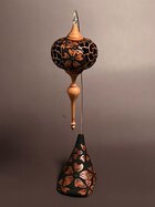
I personally have a hard time taking photos. Of the two you posted I like the first one a little better than the second.
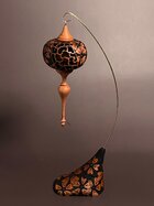
The second photo, I like the base better but it appears the ornament is closer. Maybe needs a little more brightness on both.
The second photo, I like the base better but it appears the ornament is closer. Maybe needs a little more brightness on both.
Looking good Ted! My first impression is that 3787 is almost straight on and 3784 is almost all the way from the side. Would a photo half way between the two show a little better? A 3/4 view might give a little more feel of drama and more 3D effect of the entire project? Bringing the viewer in closer to the subject is much better.
The other thing is 3784 has little or no shadow around the base and almost looks like it is floating... not grounded.
The background color looks tinted but not as much as your first effort. Have you been able to look at the photos on another computer (monitor)? Sometimes monitors have a color shift that can affect what you see compared to what others might view on theirs.
I am still just ogling that beautiful decorating you did on the entire ornament and stand! So nice!
Ted, take my comments as coming from someone with no photographic expertise…doesn’t stop me from sharing my uniformed opinions though ")
1. I don’t like the wire hanger conflicting with your ornament in the first photo, I find the second pic a cleaner one of your ornament
2. Prefer the first perspective with your piercing on either side. Maybe I just like more piercing it shows vs the more solid of the second photo. I suspect I’d like Curt’s suggestion even more with a slight piercing on one side, then a full solid , then full piecing panel, and then a partial solid panel - if that makes sense
3. I think I’d like it with a less colorful background better, and probably more light or brighter. But someone with photo expertise like John should really step in here.
Last point - BEAUTIFUL PIECE !!
The first (3787) is a better view of the ornament, but the wire is confusing if this is the only view you get to show. Can the ornament be rotated to show the flower better in the second pose (3784)?
Both images are too dark.
More shadow would make for more drama and three dimensionality. Honestly, I did not realize the ornament was pierced until it was mentioned above.
Both images are too dark.
More shadow would make for more drama and three dimensionality. Honestly, I did not realize the ornament was pierced until it was mentioned above.
Donna Banfield
TOTW Team
Hi Ted. I hope you don't mind; I took your image and did some very minor editing using Photoshop Elements. Using just 4 steps, (1 degree rotation to the left to balance the ornament/crop, then adjusted for color, saturation and contrast). Your original image and the edited one below show that it is possible to use some simple post photo editing to improve the original. It took less time to do that than it did to post this response.


Tom Gall
TOTW Team
I think you just need more light. Experiment with the placement and distance of the light(s) from the object. Sometimes I get a better shot with an overhead light and a light from the side ... but many times with just a light from the side. A bounce card on the opposite side can also help to fill in shadows sometimes. Are you using a camera or a phone?
Sometimes some of my better shots (with my old camera) are taken in the daylight (no lights) on the "auto" setting. I take a lot of shots and then choose the best ones .... because I don't know what I'm doing!!! Lately I've taken some photos with my phone which aren't too bad, but I have to do more cropping & straightening.
The position of the stand in your 2nd photo is better ... more visual information. I see you got rid of that ribbon thing or whatever that was. Love the ornament and a better photo would do it justice.
Sometimes some of my better shots (with my old camera) are taken in the daylight (no lights) on the "auto" setting. I take a lot of shots and then choose the best ones .... because I don't know what I'm doing!!!
Lately I've taken some photos with my phone which aren't too bad, but I have to do more cropping & straightening.The position of the stand in your 2nd photo is better ... more visual information. I see you got rid of that ribbon thing or whatever that was.
Love the ornament and a better photo would do it justice.john lucas
AAW Forum Expert
Without seeing your photo set up it's hard to tell you how to improve it. The shadows on the back ground are distracting. Ideally you want smooth lighting on the back ground so therexarentcany distractions. Don't know if your phone has controls to alter the photo after its taken. My samsung has somevpretty good controls to change contrast,exposure and several other things.
My own grey-scale background is the opposite of yours, that is, it is brighter on the bottom and darker the higher up you go. Also, my entire background, even the dark area, is brighter than yours. Food for thought.
Wow what a difference! ThanksHi Ted. I hope you don't mind; I took your image and did some very minor editing using Photoshop Elements. Using just 4 steps, (1 degree rotation to the left to balance the ornament/crop, then adjusted for color, saturation and contrast). Your original image and the edited one below show that it is possible to use some simple post photo editing to improve the original. It took less time to do that than it did to post this response.
View attachment 85698
View attachment 85697
Yeah I saw that after I posted. LolCheck the background. Seen in both pictures.