• We just finished moving the forums to a new hosting server. It looks like everything is functioning correctly but if you find a problem please report it in the Forum Technical Support Forum (click here) or email us at forum_moderator AT aawforum.org. Thanks!
  • Beware of Counterfeit Woodturning Tools (click here for details)
  • Johnathan Silwones is starting a new AAW chapter, Southern Alleghenies Woodturners, in Johnstown, PA. (click here for details)
  • Congratulations to Dave Roberts for "2 Hats" being selected as Turning of the Week for April 22, 2024 (click here for details)
  • Welcome new registering member. Your username must be your real First and Last name (for example: John Doe). "Screen names" and "handles" are not allowed and your registration will be deleted if you don't use your real name. Also, do not use all caps nor all lower case.
Éclair Noir
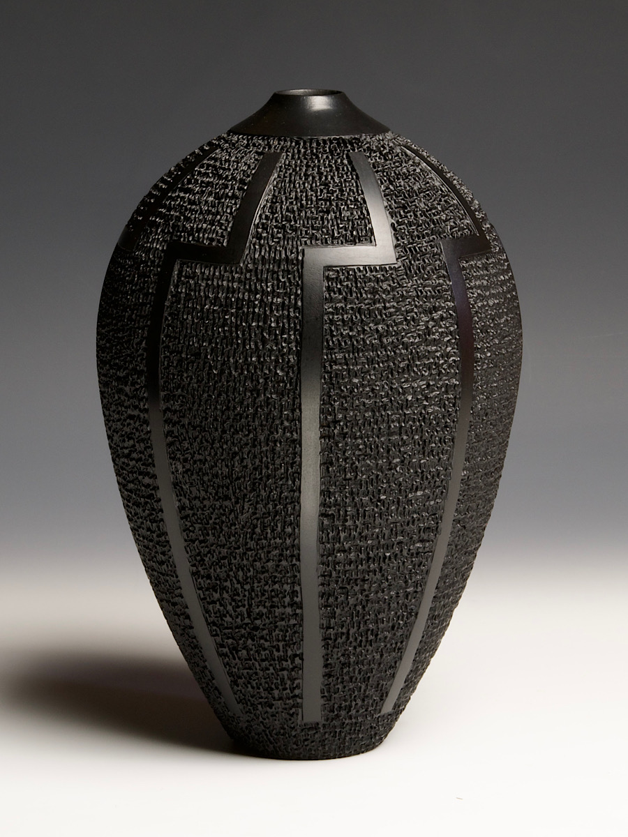
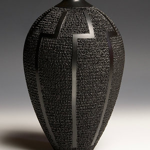
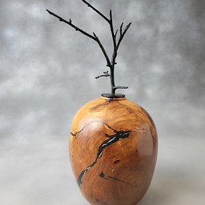
Last year I was playing with this motif on a few pieces, but was never happy with results. The branded pattern was very regular and any imperfections stood out like a sore thumb. This one was began then as well, but then set aside because I was disappointed once again. Finally, I decided to just brand over the pattern and break it up. I am much happier with the results. The motif is a simplified lightning bolt, symbolic of my career as an electrician. This piece is 5.25”d x 8.25”h. Maple, India ink, milk paint.
This is an outstanding effect created by the smooth and sharp-edged lightning bolts contrasted against the deep random textured background.

I would also like to compliment the great job you did in photographing a solid black object. The highlights work just right to create a very well done low-key image.
Thank you, Bill!
 
Wow! I don't know art, but there's something about this piece that really grabs me, and I'm pretty grab resistant. It can't be the trashy harlot-esque use of color, since there is none. The combination of form and contrasting texture must be just perfect. Spectacular.
 
Wow! I don't know art, but there's something about this piece that really grabs me, and I'm pretty grab resistant. It can't be the trashy harlot-esque use of color, since there is none. The combination of form and contrasting texture must be just perfect. Spectacular.
Thank you, Dean!
 
Kevin - Great piece. That is a lot of burning. Your description shows both India ink and milk paint. I am curious where you used them?
 
Kevin - Great piece. That is a lot of burning. Your description shows both India ink and milk paint. I am curious where you used them?
Thank you, Jim! The milk paint is the finish that I wanted, but because it is thick and may not get the low spots in the branding, or worse, might build up in the low spots, I first used the India ink like a dye to get the entire piece an even black. It’s a process that I worked out on the earlier iterations of this piece.
 
I’m late to the party but this piece is screaming to be held and the textures to be read like brail.
 

Media information

Category
Member Galleries
Added by
Kevin Jesequel
Date added
View count
1,463
Comment count
12
Rating
5.00 star(s) 1 ratings

Image metadata

Device
Panasonic DMC-G85
Aperture
ƒ/16
Focal length
43.0 mm
Exposure time
1/2 second(s)
ISO
200
Flash
Off, did not fire
Filename
8196340F-2F5C-40E5-9B11-3D7424DA1902.jpeg
File size
278 KB
Date taken
Sun, 01 January 2023 12:20 PM
Dimensions
900px x 1200px

Share this media

Back
Top