Follow along with the video below to see how to install our site as a web app on your home screen.
Note: This feature may not be available in some browsers.
Congratulations to Phil Hamel winner of the April 2025 Turning Challenge (click here for details)
Congratulations to Steve Bonny for "A Book Holds What Time Lets Go" being selected as Turning of the Week for 28 April, 2025
(click here for details)
Welcome new registering member. Your username must be your real First and Last name (for example: John Doe). "Screen names" and "handles" are not allowed and your registration will be deleted if you don't use your real name. Also, do not use all caps nor all lower case.
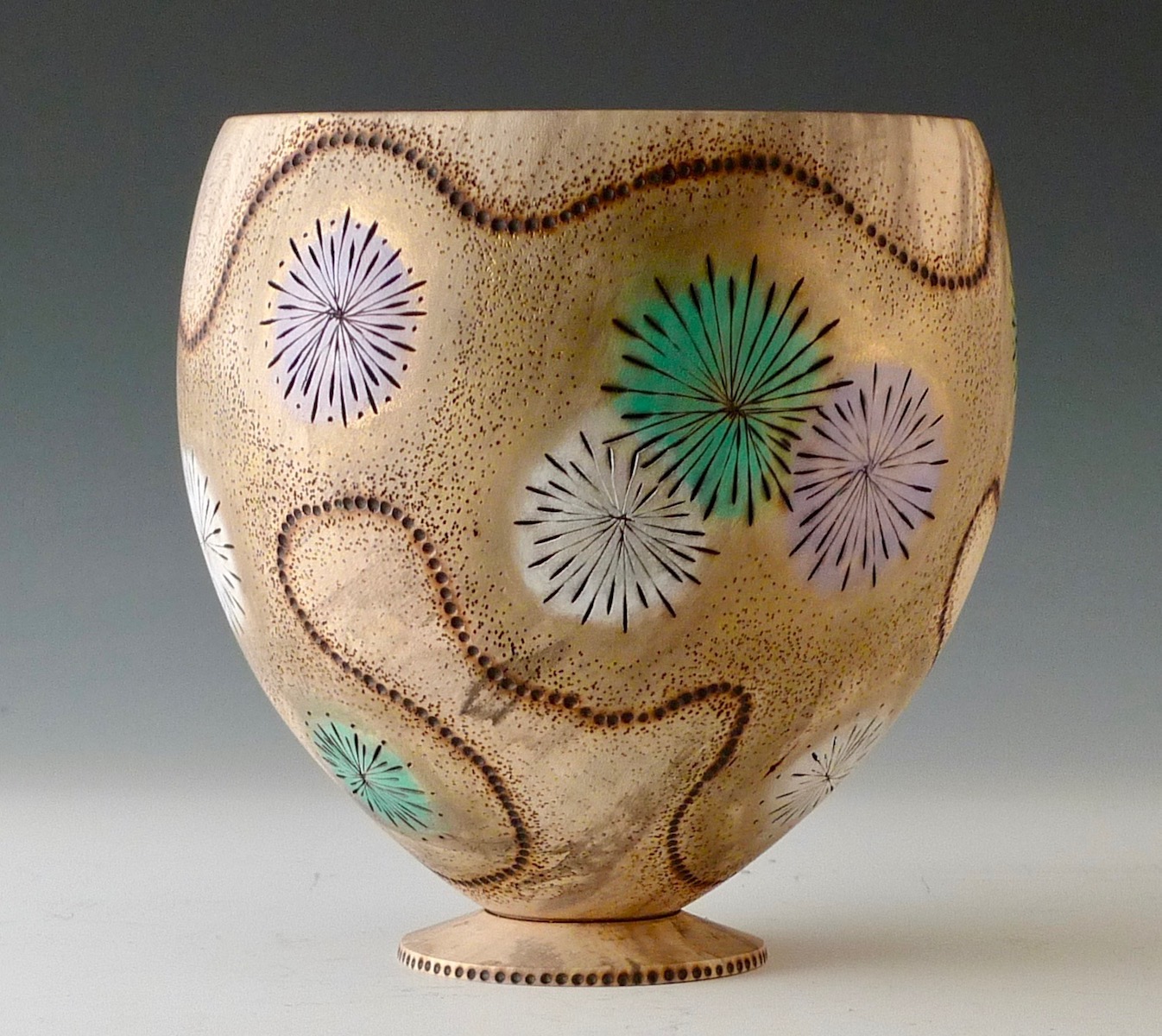
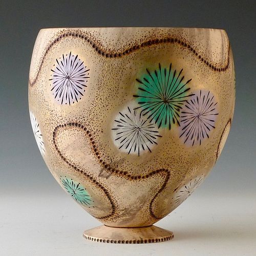
After turning I thought the spalting and color wasn’t very attractive (actually ugly) - so I decided to cover it up with some pyrography and Gilders Paste (3 colors + gold). Learned a few things on this one….like what not to do.
@William Rogers
Thanks for your thoughts... appreciate it. Are you referring to the "dots" on the foot (if so, I thought it tied together with the stippling on the vessel) or the burn line between the vessel and foot? As stated I learned a few things on this one. I didn't plan on the foot - but I hollowed too deeply and wanted to continue the line on the form. I felt the base would have been a little too small for stability so I turned the tenon into a foot. Thanks again for your comment.
@Tom Gall yes the dots. Everything is just an opinion. For me the dots are straight where the dots on the vessel flow. I really like the piece, just my opinion.
Lol, I love the dots at the foot Tom, the line between the foot and main vessel as well. I think they tie the vessel together. Your fireworks look great! Differing opinions, I love this stuff!!
This site uses cookies to help personalise content, tailor your experience and to keep you logged in if you register.
By continuing to use this site, you are consenting to our use of cookies.