• Beware of Counterfeit Woodturning Tools (click here for details)
  • Johnathan Silwones is starting a new AAW chapter, Southern Alleghenies Woodturners, in Johnstown, PA. (click here for details)
  • Congratulations to Jim Hills for "Journey II" being selected as Turning of the Week for May 6th, 2024 (click here for details)
  • Welcome new registering member. Your username must be your real First and Last name (for example: John Doe). "Screen names" and "handles" are not allowed and your registration will be deleted if you don't use your real name. Also, do not use all caps nor all lower case.

Design Critique

Joined
Jul 18, 2006
Messages
643
Likes
2
Location
Central Florida
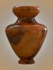
I just completed this vase. Mahogany with a walnut ring at the neck. About 11" high, 8" max diameter, hollowed to 3/16" wall, weighs a little over a pound.

I was constrained by some initial dimensions supplied to me (4.5" mouth, 3.5" neck, 9" interior depth). One minute I like it. The next I think it looks "clunky".

If I can insert a picture, you should see it below. What do you think? (Don't worry about hurting my feelings.)

Ed
 

Attachments

  • CRW_9182a.jpg
    CRW_9182a.jpg
    74.9 KB · Views: 556
Joined
Aug 8, 2005
Messages
284
Likes
1
Location
Ballard (Seattle) WA and Volcano, Hawaii....on top
Ed,

Looks like a nice turning job! Were the darker marks a spalting or darker heart wood?

The rim strikes me as heavy and out of proportion to the rest of the piece, though all has been nicely executed and finished.

A techinique folks have showed me and suggested in these forums is to step back from the piece with it upright as you have photographed it. Then squint so the piece is seen as more of an outline with little of the detail and workmanship showing. That way you can concentrate on the shape itself.

Fair warning. I am a fairly new turner so my design eye should be suspect.

How about some other thoughts from folks??!!

Dave
 
Joined
Jul 18, 2006
Messages
643
Likes
2
Location
Central Florida
Malcom - I agree with your assessment. It looks top heavy to me. The recipient has already declared "it's EXACTLY what I wanted", so I can't change it now. I don't think I'm going to sign my name on the bottom though. She's going to put a large arrangement of wooden flowers in it. Maybe it will look better then..........

Thanks for the feedback.


Ed
 
Joined
Jul 18, 2006
Messages
643
Likes
2
Location
Central Florida
David - The darker areas near the widest part are sapwood that remained. The really dark areas / veins near the foot were spalting and voids from insect damage / rot. I filled the voids with a mixture of epoxy and sawdust (purpleheart) that was a good match with the spalted wood.

I agree with your assessment of the design.

Thanks

Ed
 
Joined
Nov 7, 2005
Messages
882
Likes
2
Location
Wimberley, Texas
Artistic Vision?

Having approximately zero artistic ability, I envy those who have it in any form. Nevertheless, as the saying goes, I know when I like something. Sometimes by just staring at a piece for a while (as David Somers suggested), you can "see" what you don't like about it and fix that area. For example you might hear your brain say stuff like "that line is too straight and would look better with a slight curvature", or "that place is curved too sharply and would be better if smoothed a bit". Of course you don't want to hear "oh crap I made that part too small", but then you might hear "but if it is blended smoothly into this next area it will look great".

Just some thoughts on creating the illusion of artistic ability. There's no substitute for the real thing of course, but one can do the best one can with the resources available, and sometimes improve on "the best one can".
 

Bill Boehme

Administrator
Staff member
Beta Tester
TOTW Team
Joined
Jan 27, 2005
Messages
12,903
Likes
5,194
Location
Dalworthington Gardens, TX
Website
pbase.com
cobia said:
.........The recipient has already declared "it's EXACTLY what I wanted", so I can't change it now She's going to put a large arrangement of wooden flowers in it. Maybe it will look better then..........
You may have decided that it looked a bit out of balance and top heavy, but if the recipient thinks that it is great, then that is all that matters. Considering its intended use, the shape may work quite well.

Bill
 
Joined
Nov 30, 2005
Messages
286
Likes
4
Location
Mendota IL
Ed,
Bill is right: 'the customer is always right.' The top has been discussed. I may have left off the foot. I went to a class at Crafts Supply and Dale Nish told me you'll alway be happier with a piece if it doesn't have a foot on it. I am finding that to be true. I don't know if its my lack of skill in turning a light and graceful foot or a design concept. Picture your piece without the foot or the top and you have a very classic and graceful form. Regardless its a well executed piece and again the customer is happy.

Frank
 
Joined
Jul 18, 2006
Messages
643
Likes
2
Location
Central Florida
Bill - I gave them what they wanted but I can't help but wonder if they would have been equally excited about a design that was more balanced, even if it wasn't what they initially asked for.

I'm a relatively new turner, so I try to use each project to advance my skills and to refine my eye for design. I just can't shake the feeling that I've taken a step backward here.

I think the best therapy will be to get another project underway quickly. As a matter of fact, I'm going down and put another piece of mahogany in the lathe tonight.

Ed
 
Joined
Jul 18, 2006
Messages
643
Likes
2
Location
Central Florida
Frank - I personally have mixed feelings about how to do a bottom. I like the graceful / modern look of a footless vessel, but I really enjoy the challenge of turning a complex foot on a vessel that gives it a more formal / classic look (if I happen to get it right).

I find I'm frequently asked something like "why is it so skinny / plain at the bottom, did you accidentally break off the base?" when I show people my "footless" pieces next to some "footed" ones.

The foot on this piece is kind of plain. I started to run into very questionable wood and decided to quit while I was ahead rather than risk ending up with a "footless" vase. (This would have been somewhat of a problem since I got carried away and hollowed a little ways into the foot area when I was working on the interior.)

Ed
 
Joined
Oct 4, 2005
Messages
156
Likes
0
Location
KCMO
Website
www.zionfire.com
Foots, Feets, Bottoms, Curves, and Intentionality

I am not a design guru, but have a few classes under my belt and try to study shapes, forms, and curves.

Some folks object to feet on vessels because they claim it makes them look heavy on the table. That may be true sometimes, but I think that at least as often or not, the piece would look just as heavy without the foot. Why? Ratio of height to width, curvature of the body of the piece, or color contrast issues, mainly.

Strictly my opinion, not quoting anyone or blaming anyone here :D, I think there are two things that cause feet on vessels of any sort to be successful or not.

If the foot gets in the way of the beholder's eye and blocks or distorts the completion of the graceful curve, it's not a good foot. For me, when I create a foot, and when I observe a foot, I'm still looking for the mental completion of the curve. It can be beneath the table, but the mind should still want to complete it. It can be at the table level and the foot is there but does not interfere with that imagined line. It's subtle, in other words.

The other point that I feel is the real biggie on otherwise nicely conceived and executed vessels is that the feet are not as well thought out as the rest of the vessel, and is not executed with intention. A crisp line at the juncture of foot and vessel will enhance the curve of the piece. "Smoothing it in" often disturbs, distorts, or disguises the body curve. For me, that makes it less satisfying. I have to think too much about the piece to try and discern the vessel itself. The foot has gotten in the way again.

Look at a wok and it's ring. It's a perfect example. The ring is pretty large, seen in terms of ratio, but there is a distinct line that does not disturb the mind's view of the curve on the bottom of the vessel. Flip the ring over, the ratio is even larger, and on some woks, the perfect curve has become an imperfect inverted, chopped cone.

Look at ceramic forms, blown glass forms, sculpted, moulded, carved forms. Commercial vessels of use and decorative stuff. check out how they stand on the table. See what works. For most round bottomed vessels, think egg shell and provide a base that doesn't distort the curve, even though it's out of the very same piece of wood. Think tee and golf ball. The tee does not get in the way visually or physically. It's a distinct item in and of itself. Does its job without butting in, as it were.

Does that make any sense??
 
Joined
Oct 4, 2005
Messages
156
Likes
0
Location
KCMO
Website
www.zionfire.com
Learning about Curves

Finally found my notes from the John Jordan weekend!

The name of the book that he recommended is Ceramic Forms and it's written by Peter Lane. The book is commonly available in public libraries and on Amazon.com. Hardback printed in 1998, paperback in 2003. Used paperback starts around $23 today.

My public library has one copy, but there's a wait for it right now. At one point, there was a 30-day wait! That was when university was in session, though.
 
Joined
Jul 6, 2006
Messages
23
Likes
0
Cobia
i think the vase IS in proportion. I realy like the finish. The style reminds me of egypt. I have no negitive critique for ya only positive. BE DIFFERENT and do not listen what these people say. Keep going with what the wood wants!!!
Jude
 
Joined
Apr 28, 2004
Messages
25
Likes
0
Location
Central Ohio
Ed, At first it reminded me of a design that might come from the Art Neuveu period. I'm not super high on the Walnut ring but.... I think if you had to do it again to the same design specs on the outside, I would make the top portion just a bit smaller in diameter and shorter in height (the top bowl), that might give a more balanced feel. Heck, square it up, open up the top to a bowl form, paint it silver and you have the Stanley Cup. Ok, that last line was a joke but I think that it's important the customer is happy. It's a great feat to actually produce what they were invisioning for you to make. Nice finish
 
Last edited:
Joined
May 18, 2005
Messages
111
Likes
0
Location
Verona - Italy
Website
www.la-truciolara.com
This is not a critique, as how can one critique art when it often demonstrates one’s personal preference.
But the remark written above that it looks like a bowl sitting on another one reflect the fact that both bottom lines are equal.
to give the appearance of one piece only you could have followed the natural curve of the neck therefore your “upper vase†rather than being convex would have been concave.
I think doing so might have somewhat slimmed the overall shape.

For overall proportion if you use the "Golden Ratio" you can't be wrong :)
 
Last edited:
Back
Top